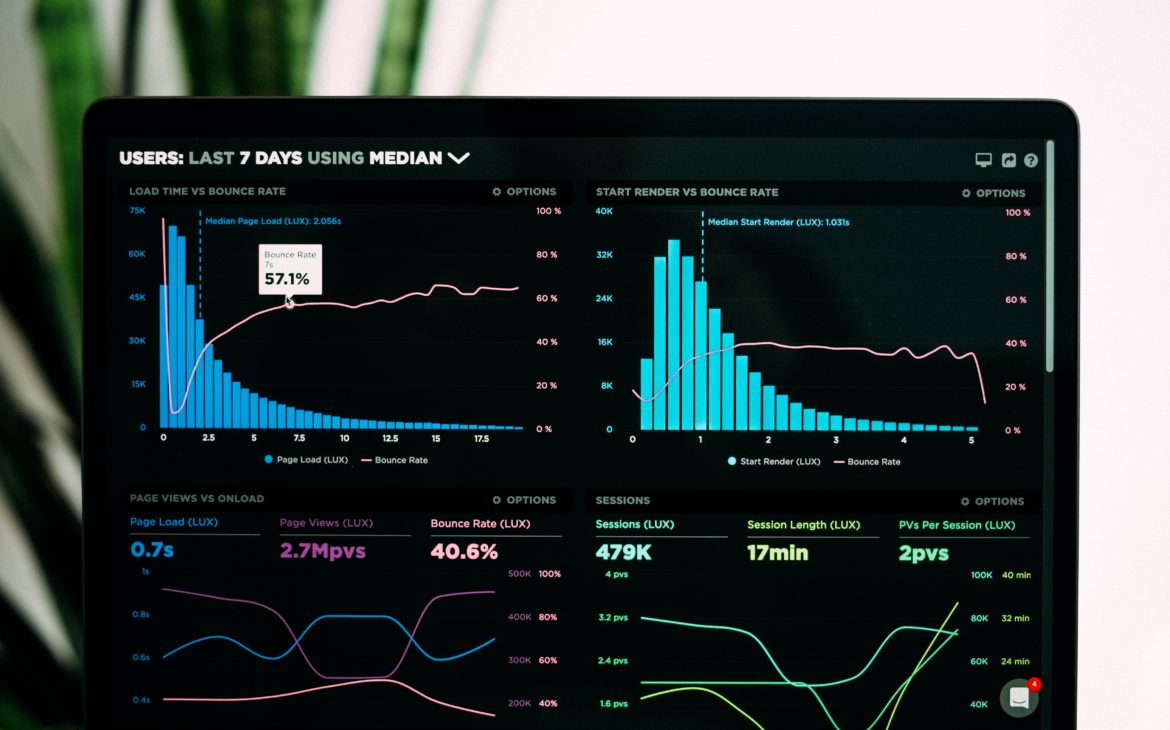
As you have discovered, when working with databases and tables of information, every single field is captured, whether or not all the data is needed for reporting. Most reports or dashboards are filtered in some way to restrict access to just the needed fields, allowing users to interact with the dashboard and select only the filters they need at that time. As a natural part of data analyst work, you will deal with data that needs to be sorted using various sort commands and methods.
When developing business requirements, you must consider what types of data might be filtered and what sorts might be applicable up front. You’ll need to determine where it makes sense to use hard-coded filters, interactive filters, and visuals as filters, and what the appropriate sorts are.
Another common way of filtering data is by date. Businesses often rely on dates in reports when making decisions, so the ability to filter by date range is key. The analyst may also need to create data tables to link data with dates. Be sure to ask what dates are applicable for the reporting project, so you can figure out how to sort them for the best user experience
Sorting Data
Sorting data is a technique that is commonly deployed by data analysts. Data is typically in the natural order, meaning the order in which the data is entered. This is often not effective for the display of the report. The most common sort method is ascending and descending order, meaning A–Z or Z–A for text-based fields. For numerical data, ascending is the minimum number sorted to the top and the maximum number at the bottom, with descending order being the reverse of that. While this is the most common method, you will also encounter more advanced sorting methods.
What are Advanced Sorting Methods?
Multi Sorting
Multi-sorting is a method of sorting where you sort within a sort. Imagine that you are reviewing the phone list. It has each last name sorted, then within the last name it sorts the first name. This helps to display all the last names, as example Smith together, and then sorts the first names A to Z. Not all data is appropriate for multiple sorting, but when you have groups of data you can easily sort them using the multi-sort options that are available in all data tools.
Top N and Bottom N sorts
Top N and Bottom N sorts sort the data to display the top or bottom portions of data in a set based on how many values exist in the set and the number you specify as the portion, or N. For example, if you want to view the top 25 most-ordered products, you would use the function built into the data software to create the Top N sort, which will filter your data to the specified top 25 values.
Custom Sorts
Custom sorts are where you create the data set to include the value and the sort order you need for your visualization. This is great for nominal data that does not have a sort, but you need to create one. A great example is education from high school, some college, bachelor’s degree, and graduate degrees. If you sort this data by the first letter of the education, then it would be “out of order” from how you obtain the education. Traditionally you’d attend high school first before any other type of education. You can easily create the category list and apply the appropriate sort order. Then you would use that table to sort the information into your data model.
There are also available sort functions, like Rank and Order. These functions are sort related, but they both supply different information to the set, and then you could sort by them if needed.
Filter Methods for Visuals
As part of developing the business requirements for data, it is important to determine where filters will occur and if these filters are hard coded or interactive.
Applying Hard-Coded Filters on Visuals
Hard-Coded Filters on Visuals Hard-coded filters are coded into the view or the visual. The filters are automatically applied to the visual; the user does not adjust them. Most visualization software programs have filters that can hard code a visual, page, or the entire report by whatever field and condition you specify.
It can be useful in many business scenarios. For example, you could hard code a manager’s report so that it only shows the employees listed as being under that manager’s supervision. You might create a hard-coded page filter so that all the visuals on that dashboard are automatically filtered by that manager. In another example, you might use a hard-coded filter that does not show null or blank values in the report. A variety of hard-coded filters can be applied to meet reporting and business needs within your organization
Applying Interactive Filters to Visuals
Interactive filters are filters that allow the consumer to adjust a slicer or filter option on a dashboard to narrow down the data they want to see. As an example of when interactive filters can be useful in business, consider a sales organization that has multiple products, and each salesperson has access to view the sales of every product. The company wants the salespeople to be able to choose the products that they are interested in viewing. Each salesperson at the company needs to be able to see different products, either one at a time or many at one time, so they can investigate issues or highlight key information about that product. In this case, a slicer or filter option would allow the salesperson to filter the data to their specifications.
Visuals That Filter Other Visuals
In the world of dashboarding, visuals can also serve as filters. This means that when a consumer clicks on any column or bar, all the data is filtered based on that selection. This type of filter can be especially meaningful when people are seeking information for actionable insights. For example, in a Classic Vest research study, suppose you want to see how both small and medium Classic Vest products are performing. Having a visual filter, like a matrix, will allow us to select and see that specific data
Filtering by Date Ranges
In almost any organization across all industries, dates are one of the most common fields used as a filter for data. Businesses often like to analyze and organize data by time. For example, an organization might want to run a daily report that shows what occurred each day. To do so, a filter can be applied that only shows that day in time.
Methods for Filtering by Date Range
A company also might want to filter data by a period of time, such as weekly, monthly, or annually. This is done through the use of a date filter, which filters a data field by a starting and ending point. The most common statement used for this filter would be a BETWEEN AND statement that would allow you to look at a data field between a start date and an end date. This statement can also be written as greater than or equal to a start date, and less than or equal to an end date.
When writing the proper business requirements for any reporting project, you will want to identify which fields are needed for filtering, so you can identify which dates may be needed for any given report. For example, when reporting on the onboarding of new employees, we might want to look at their actual hire date, which may differ from their start date. We should identify upfront which dates are needed for the report. Most reporting tools will have some form of date hierarchy and syntax that allow you to filter by date.
Date Tables
Data analysts often implement a date table when the data only represents the date in which an event or transaction occurred, and not all the dates within a specified period. For example, there are 365 days in the calendar year, but a company won’t have sales on literally every day. If you want to see how the organization performed on all days of the year, you’d first need a data set that contained all the days of the year, and then you could establish a report that would show each day of the year and whether or not there were sales on that day.
Data analysts often implement a date table when the data only represents the date in which an event or transaction occurred, and not all the dates within a specified period. For example, there are 365 days in the calendar year, but a company won’t have sales on literally every day. If you want to see how the organization performed on all days of the year, you’d first need a data set that contained all the days of the year, and then you could establish a report that would show each day of the year and whether or not there were sales on that day.